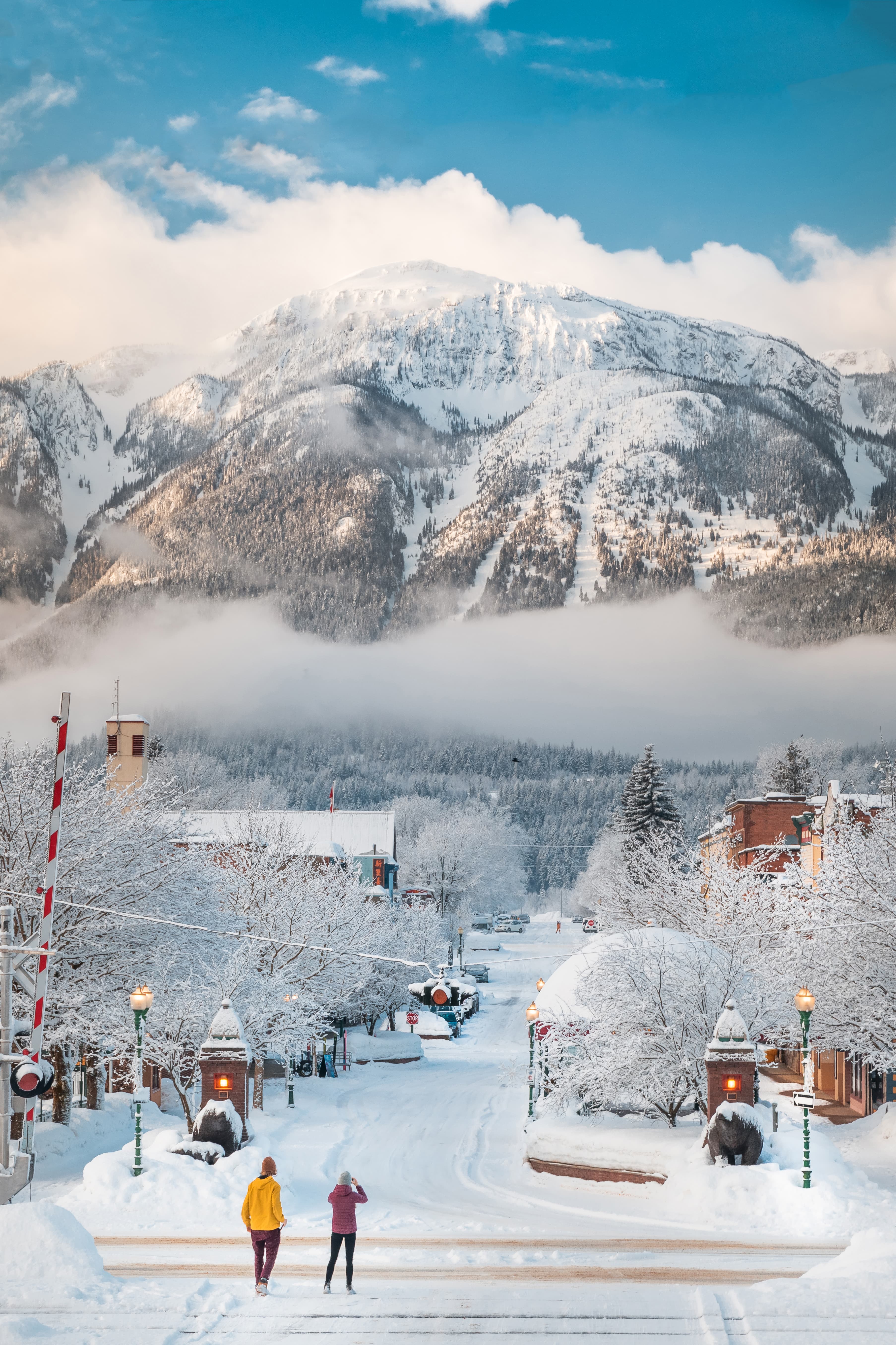
Mount Macpherson
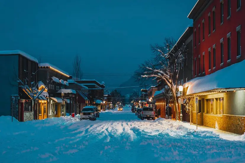
Mackenzie Ave
Ian Houghton
Welcome to Revelstoke.

Downtown Revelstoke
Grizzly Plaza
Ian Houghton
Welcome to Revelstoke.
Welcome to Revelstoke.

National Parks
Glacier National Park
Laura Szanto
Welcome to Revelstoke.
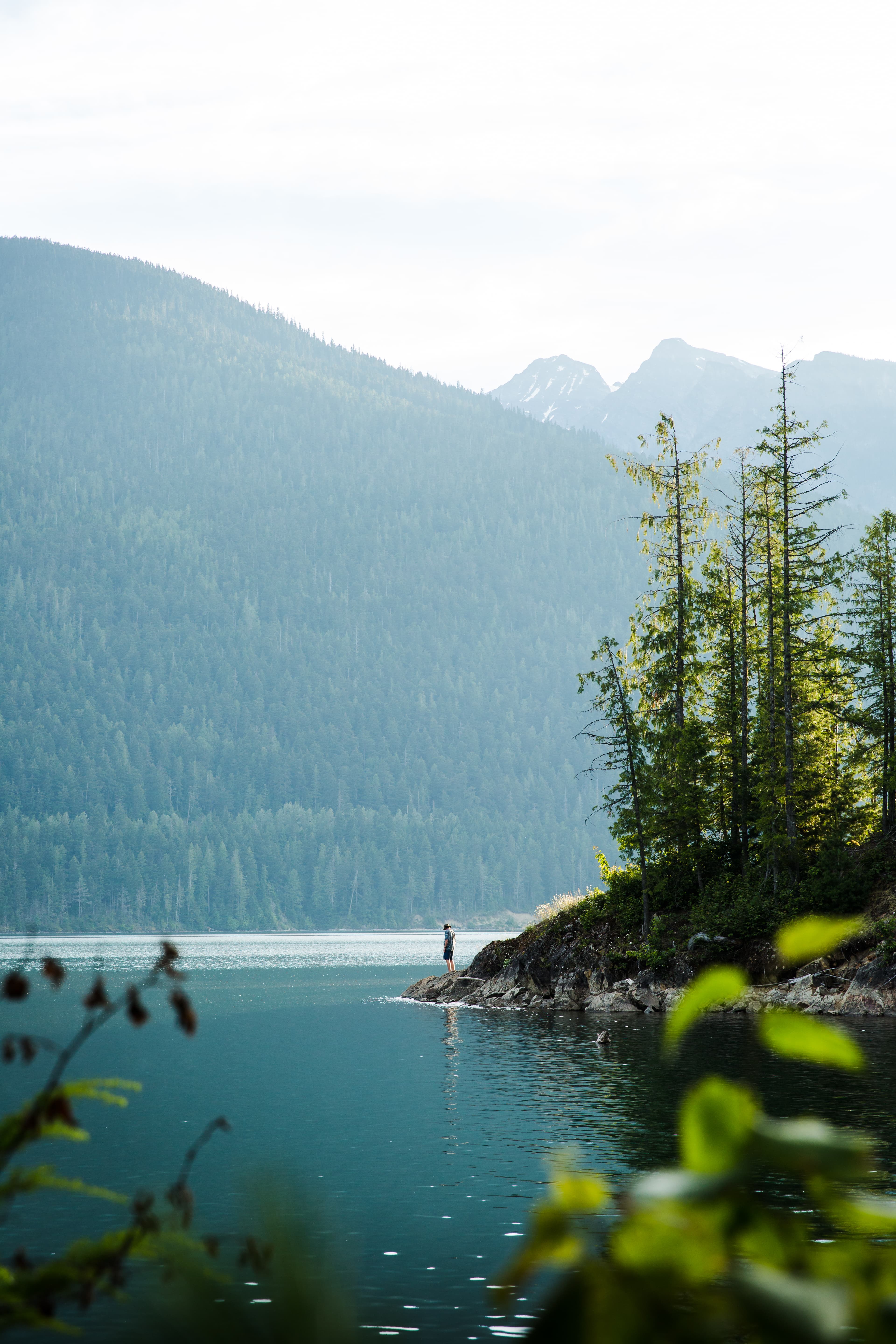
Lake Revelstoke
Lake Revelstoke
Bjorn Patterson
Welcome to Revelstoke.
Things to do
Explore.
Explore By Season.
True seasonal climate means make sure you plan accordingly. Discover how to make the most of epic snowfall, whats accessible in the spring and early in the summer season, and what to expect during our sunny months and beautiful crisp fall.

Prepare.
Getting here & Around
Tips and tricks to get you to the heart of these mountain views, around the town and beyond.
Seasons & Climate
What to expect from our average snowfall, accessibility in the spring and early in the summer season, and what to expect during our sunny months and beautiful crisp fall.
Webcams
Check out the current conditions of the roads surrounding Revelstoke as well as the ski resort cameras & snowmobile area cameras.
Visitor Information
From assistance with accommodation bookings and activity suggestions, directions and hot tips on local favorites.


Itineraries
Get Stoked.
Newsletter.
Get 15% off at our REVY Store located in the Revelstoke Visitor Centre when you sign up!
The Real Stoke
Fuel Your Fire Within.
Experience #TheRealStoke for yourself.


)
)


